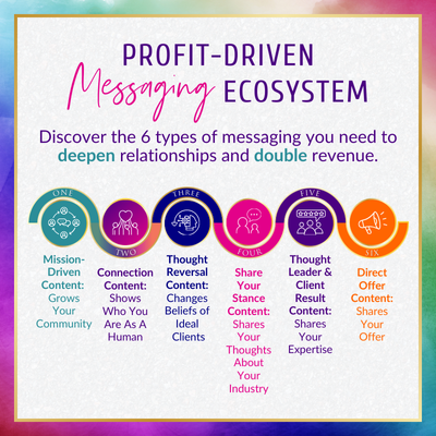
Writing online content is about a lot more than just writing blog posts and articles. Since the web is such a visual medium, sites and organizations are harnessing the power of visual content to spread their message. Even if you don’t have strong graphic design skills, many organizations need the talents of a writer to research and write the content before it’s handed off to a designer to create the final product.
I’ve created several infographics in my career, one of which was featured on Mashable. I’ve learned that while infographics can cover just about any topic, their creation follows the same basic process. Here’s the steps you should take to create stunning and informative infographics of your own.
5 Steps To Writing Awesome Infographic Content
1) Choose A Strong Concept
Everything flows from the idea, so a strong concept is essential before you get started. A strong concept is one that is either actionable (i.e. it gives advice in a way that allows readers to make a real difference in their day to day lives) or informative (i.e. it distills the essence of a complex idea into understandable stats and visuals.) Ideally, you want to leave readers feeling like they understand the topic in a new and deeper way.
A good resource for checking out strong infographic concepts is coolinfographics.com. Data visualization expert Randy Krum curates a selection of his favorite infographics, and offers his comments on what makes them or work or how they can be improved.
It’s also essential to pick a topic that is neither too narrow nor too broad. If the topic is too broad, then the infographic will lack proper focus. If it’s too narrow, then it will be very difficult to research. For example, if you want to research an infographic about Crime, then you might consider narrowing it to something more simple like “Cybercrime.”
2) Gather Your Facts And Data
Once you have your idea, it’s time to put your research skills to the test. Wikipedia is a fantastic resource that can give an overview of your topic, as well as stats that you can pull. If you spot a fact or figure you can use for your infographic, grab the info as well as the original source. In Wikipedia articles, factual claims are usually sourced with footnotes at the bottom of each article.
Another good resource is Statistic Brain, a database of statistics organized by topic. For example, if you are doing an infographic on online dating, you can review a slew of statistics pulled from authoritative sources.
3) Organize By Topic
While technically an infographic can be any size, web infographics are usually long and skinny in order to make it easier to embed on blogs. Since, just like an article, readers will view the infographic from top to bottom, it’s important to think about how you’re going to organize the facts and figures you have assembled.
Like an article, the information should flow naturally from one subject to the next. The information at the top should introduce the viewer to the general idea, and then the lower sections should elaborate and expand on the idea. Make your conclusion strong by either ending with a particularly shocking or notable fact or an imperative call to action.
4) Think Visually
A common mistake that first time infographic writers commit is treating the infographic like it’s an article. You should try to think of ways you can communicate the information visually, which you can then pass off to the designer. An easy way to do this is to gather a lot of numbers and statistics, which the designer can then represent visually. If you want to get some good ideas for data visualization, check out the website dataisbeautiful.net.
5) Promote On Social Media
Once the infographic is created, the work isn’t done. Even if you are not directly responsible for marketing, it’s a good idea to do some marketing work yourself. Something as simple as sharing the content on Facebook can greatly increase the number of views, and make your client very happy.
The Big Take-Away: Inform And Educate Visually
Creating an infographic is a collaborative process, so your designer should introduce their own ideas on how to communicate the information. The final product is a combination of research, effective communication, organization, and informative graphic design. When all those elements come together, it creates something that can bring a new level of understanding to complex topics.
Logan Strain is a writer who regularly contributes to Instant Checkmate’s blog, a father, and a podcast addict. When he’s not browsing reddit, playing with his daughter, or binge-watching Netflix, he’s creating top notch web content. Follow him on Twitter @LM_Strain.
